

Creative Bullshit
The Dark Side of Creativity: Part 1

Hi,
This is the start of a new, brooding series of posts I'm calling The Dark Side of Creativity. After finishing the Everyone's Creative Manifesto, where I dig into how I believe we should use our creativity, it felt like a good idea to highlight some of the ways creativity is misused. Unfortunately, this comes in a lot of different forms.
As I've said before, creativity isn't good or bad. It just is. Creativity is humanity's way of building and growing. Everything we deliberately make or move towards is, in a way, an act of creativity. Some creativity is more or less deliberate and some creativity is more or less moral. But it's all creativity.
So what happens when we pretend that our creativity is special in some way? What happens when we try to make ourselves feel more important than others or want to try to justify our work on more than its actual merits? And what's the harm in talking a bit of bullshit every once in a while?
When I talk about "creative bullshit," I want to be clear that I mean talking bullshit about creativity. It's a more vulgar way of saying "creative mumbo-jumbo." I'm not digging into the art of bullshitting in general (though, in a way maybe I am).
It's hard to talk about in abstract so let's dig into the shit. And what better place to start than by looking at one of the greatest examples of creative bullshitting in human history.
Most of my examples of creative bullshitting are going to be from my areas of expertise, because the best way to know if someone is bullshitting is to know as much or more about the topic as they do. I just happen to be lucky that I work in marketing and branding, an industry that is fertile ground for people who make up hilarious nonsense to justify their output.
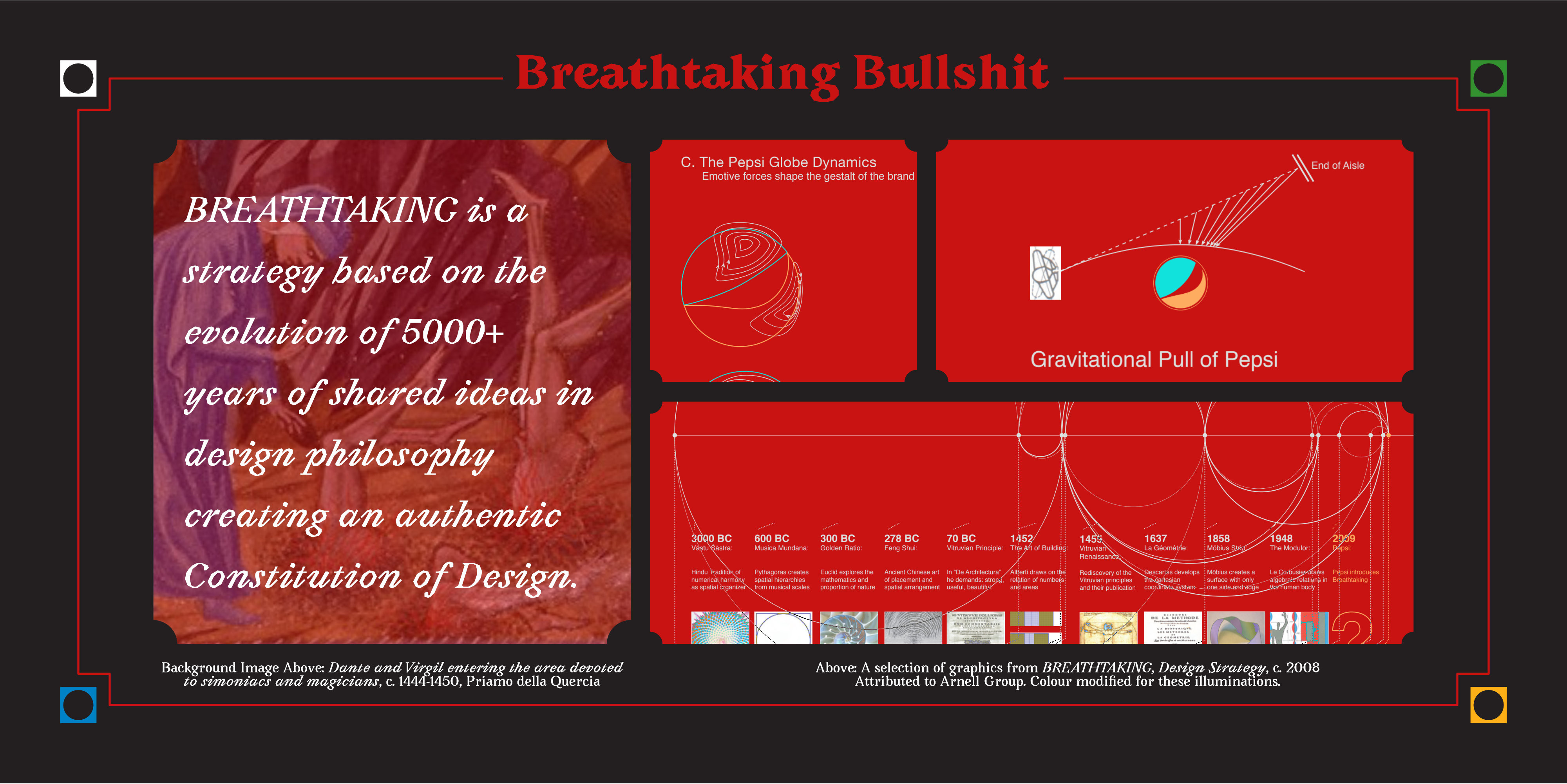
And no brand has ever been so fully filled to the brim with BS than the mid-2000s rebrand of Pepsi.
I'm not the first person to share this magnificent and borderline-incomprehensible document, but if you've somehow never experienced it before, you're in for a treat. This is a leaked internal document from Pepsi's rebranding process that is so crazy that a lot of people don't even believe that its real. Fortunately, whether its real or not, it's extreme, mind-boggling bullshittery makes for a useful case-study of a phenomenon that is often subtler and harder to notice.
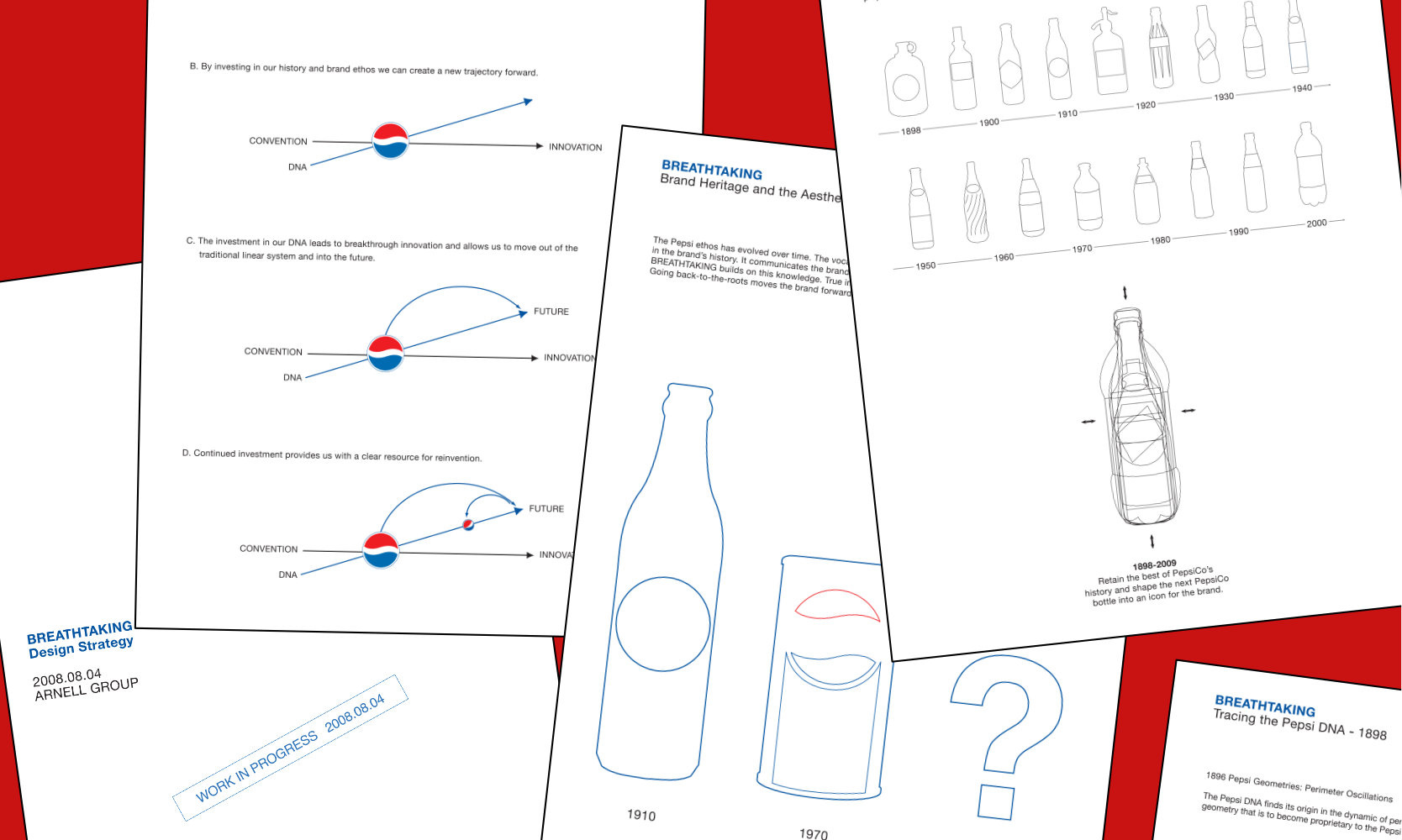
In the document, we're treated to many different examinations of the design rationale behind the then-proposed logo revision. The curvature and geometry of the logo is connected to seemingly everything that's ever existed: Hindu numerical harmonies, the Vitruvian Man, Mobius Strips and, of course, the golden section. But this is just the beginning.
There is then an extended process of drawing the same shapes over all the different Pepsi logos of history in order to find the "DNA" of Pepsi(?), as though we're pretending that basic geometric shapes can't be found in ... everything.
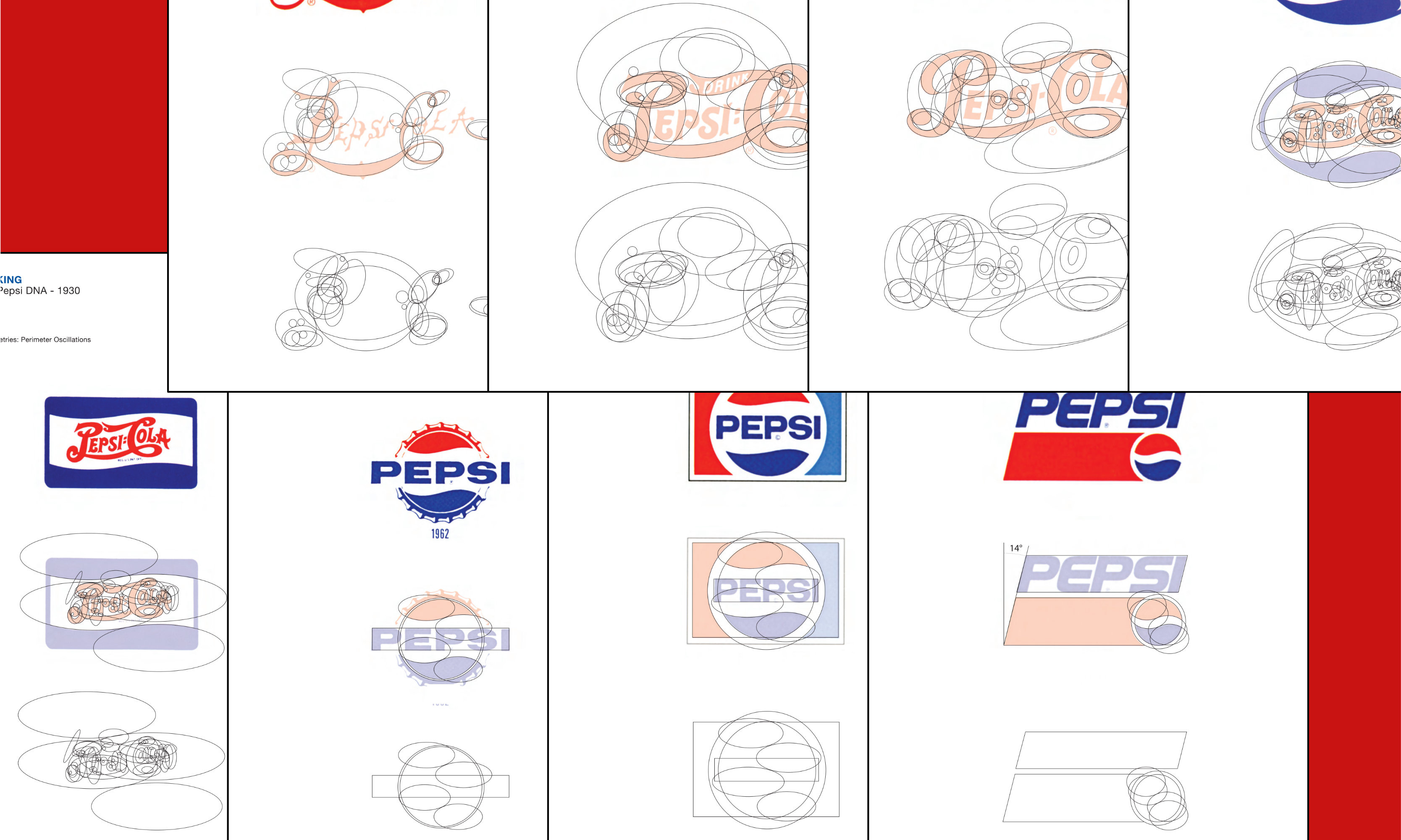
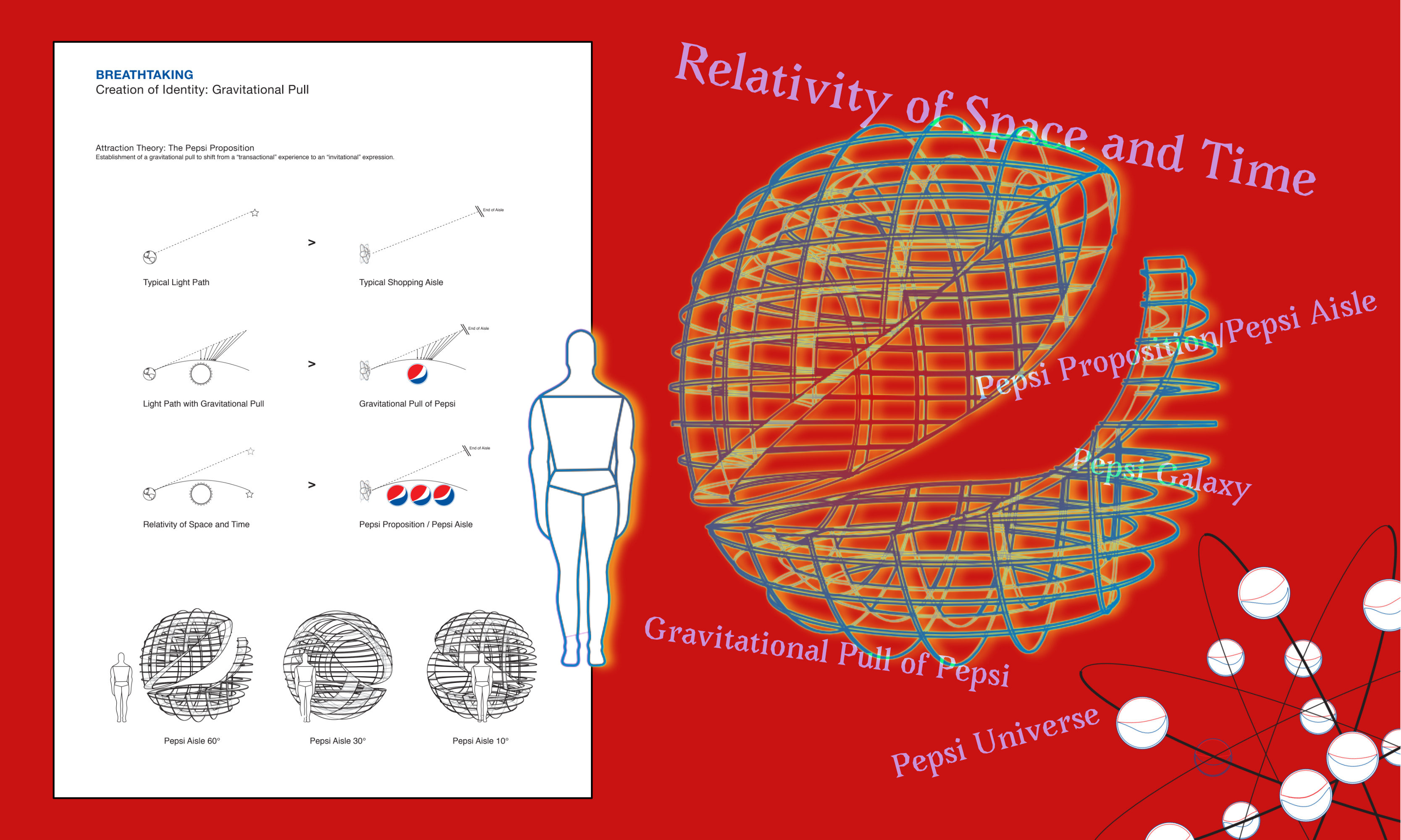
After we learn about how the aesthetics of the logo's curves are connected to a deep and rational design structure, and how to draw the logo in 8 stages, connecting and overlapping circles to fit within the logical order defined by the golden section (but not the Vitruvian Man?), we're treated to a lesson in the magnetic dynamics of earth. Because we're calling this logo "the globe," of course the shape and colour is also defined by the "geodynamo" of the earth's core and the magnetic field it creates.
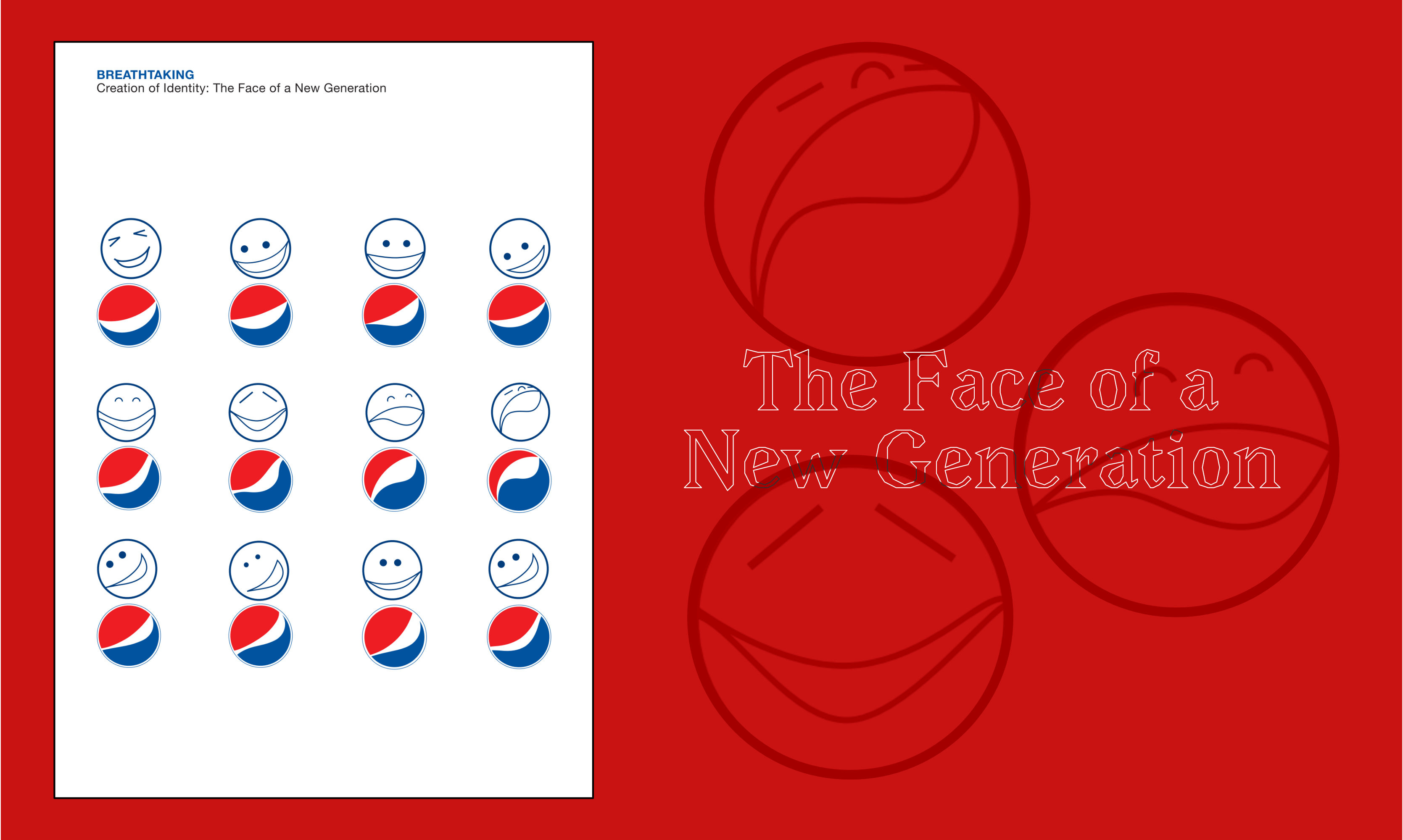
And it continues. The logo also expresses a variety of cursed human emotions before generating its own gravitational pull. The only reason I don't believe this is hoax is the sheer amount of effort that went into creating these graphical depictions of things like the "Pepsi Galaxy" and the "Pepsi Universe". It's a long, fascinating and ultimately meaningless exercise in justifying the design of a circle that is supposed to represent sugary water.
And yet, surprisingly, I think there's some value to this document. It just isn't found in the text of the document, but instead in what it represents.
When you look at the diagram defining the geometry of the "Pepsi Universe," you may chuckle to yourself and think "how silly!" Unfortunately, though, this document represents something more consequential: it's evidence. Evidence for everyone skeptical of creativity and artistic labour, proving that artists really are full of shit and that this work is really just a scam.
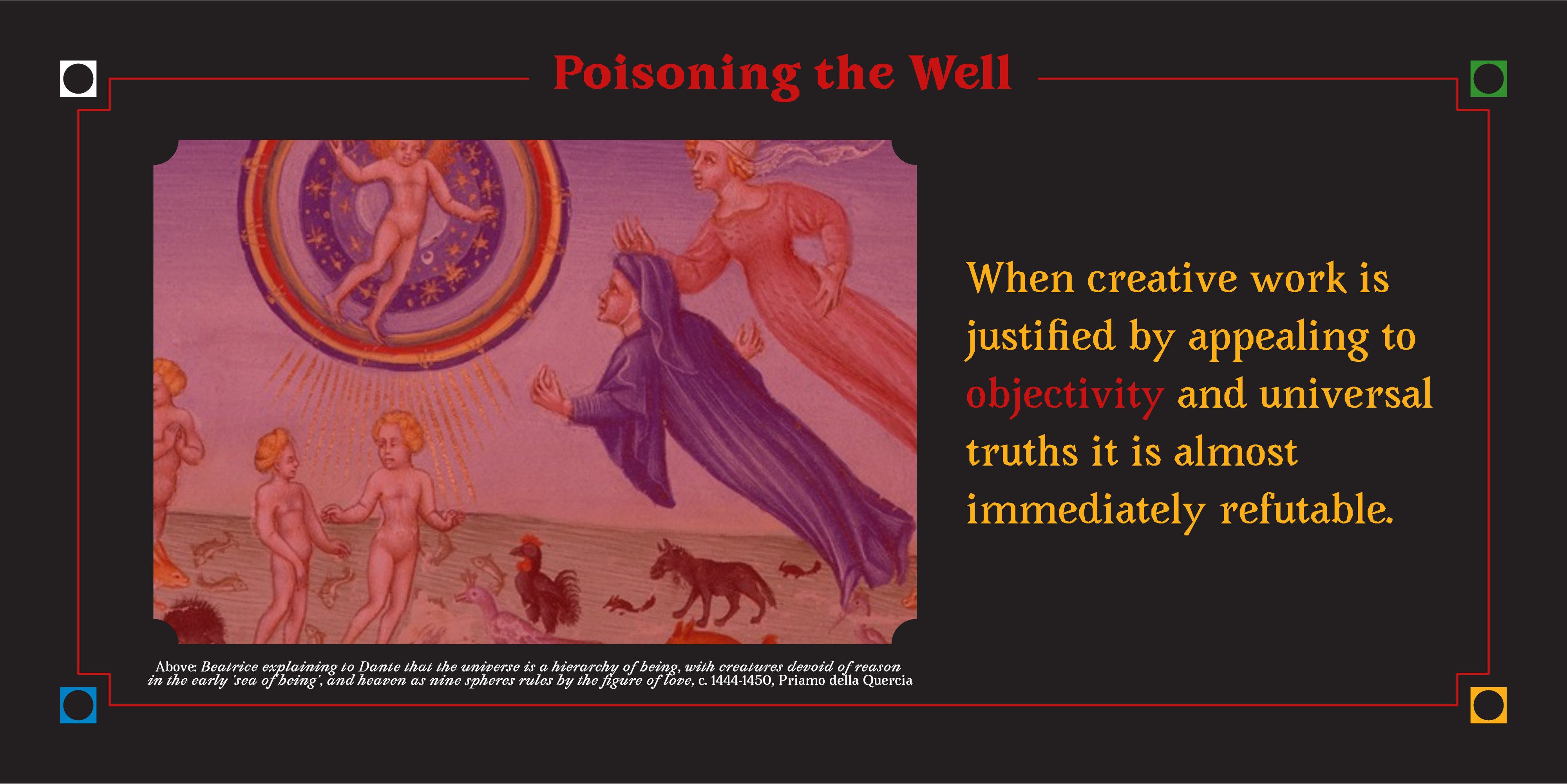
The problem with bullshitting about creative work is that, surprisingly to some, creativity isn't all bullshit. This can be hard for some people to believe but a lot of designers and artists really do put a lot of thought and care into making things, and they often have meaning in mind when they do. The difference between what we see in the Pepsi document (and in many, less notorious places) compared with the ideas driving most creative work is that an honest person creating something doesn't pretend that the meaning is going to be universal.
When creative work is justified by appealing to objectivity and universal truths it is almost immediately refutable. When you say that a colour makes people feel a certain way, you just need one person to feel differently and everything you built your idea on falls apart. For a lot of reasons (connected to the root of Everyone's Creative), many people feel at odds with creative work and the people that do it. They may feel judged, alienated, confused, foolish; all things that are going to make you feel like creativity and art are a net negative or something you want to reject. The appeal to objectivity in order to justify creative work, to these people, is proof that it's all just a facade. That it's all a scam. And the stink of that bullshit ends up getting stuck on the rest of us, becoming something we have to actively work against.
The truth has always been that there's no objectivity here. It may sound counter-intuitive but often things are only true about creative work because we say they are. A colour can represent a feeling if that's our intention, but only if we accept that it won't be true for everyone. And it only works if we're being honest about it.
Be Honest, We're Just Making it All Up
The problem with creative bullshit is that it pretends there's a truth to creativity that existed before we all showed up. It points to justifications for decisions that, often, are made intuitively or in ways that may seem shallow, derivative or false. Artists are typically just as oblivious of the impact of their work as their audience, only seeing and understanding how their intentions combine with what they were expressing after the fact. But all of that sounds a bit weak, doesn't it?
If bullshitting is meant to make our work seem more meaningful, then it fails and ultimately has the opposite effect. Instead, in my experience, talking about how loose the boundaries of meaning can be is a much better way to get skeptics on board. When we're honest about the way we get ideas or develop work (in other words, Demystify the Process) we open the door for people to see themselves as creative agents again (because they always were). Instead of saying there is meaning where there is none, saying where you hope there is meaning can help people create that meaning with you.
Practically speaking, I do this every day in my work. I make presentations a lot like that Pepsi one, with annotations on logos trying to demonstrate the intentions behind the design. The difference is that I try to make it clear that you can push back against my ideas. If I say "this colour is meant to represent growth," you're welcome to disagree. What colour would represent it better? Why is that more true for you? This is where we can start to define meaning together. But if I say something like "this colour universally represents financial opportunity" then I'm putting up a wall and saying "either you're too dumb to get this or I'm full of shit." No wonder people are skeptical of creative work.
The other reason people bullshit is to make themselves feel better. It can be scary to share your ideas and your work if you aren't sure they have merit. How nice would it be if you could say "this is why I did it this way" and nobody could argue with you? The laws of universal design bcome your scapegoat, and you can even make other people question their instincts by appealing to a higher power.
But bullshitting like this doesn't work, even if you really want to believe it. If you're worried about the thought that went into your work, you should think about it more. If you feel your ideas are too shallow, dig deeper. If you worry your decisions are arbitrary, then give yourself structure to help you make them. Don't try to come up with justifications after the fact, because that makes people distrust creative workers and ultimately makes things harder for all of us.
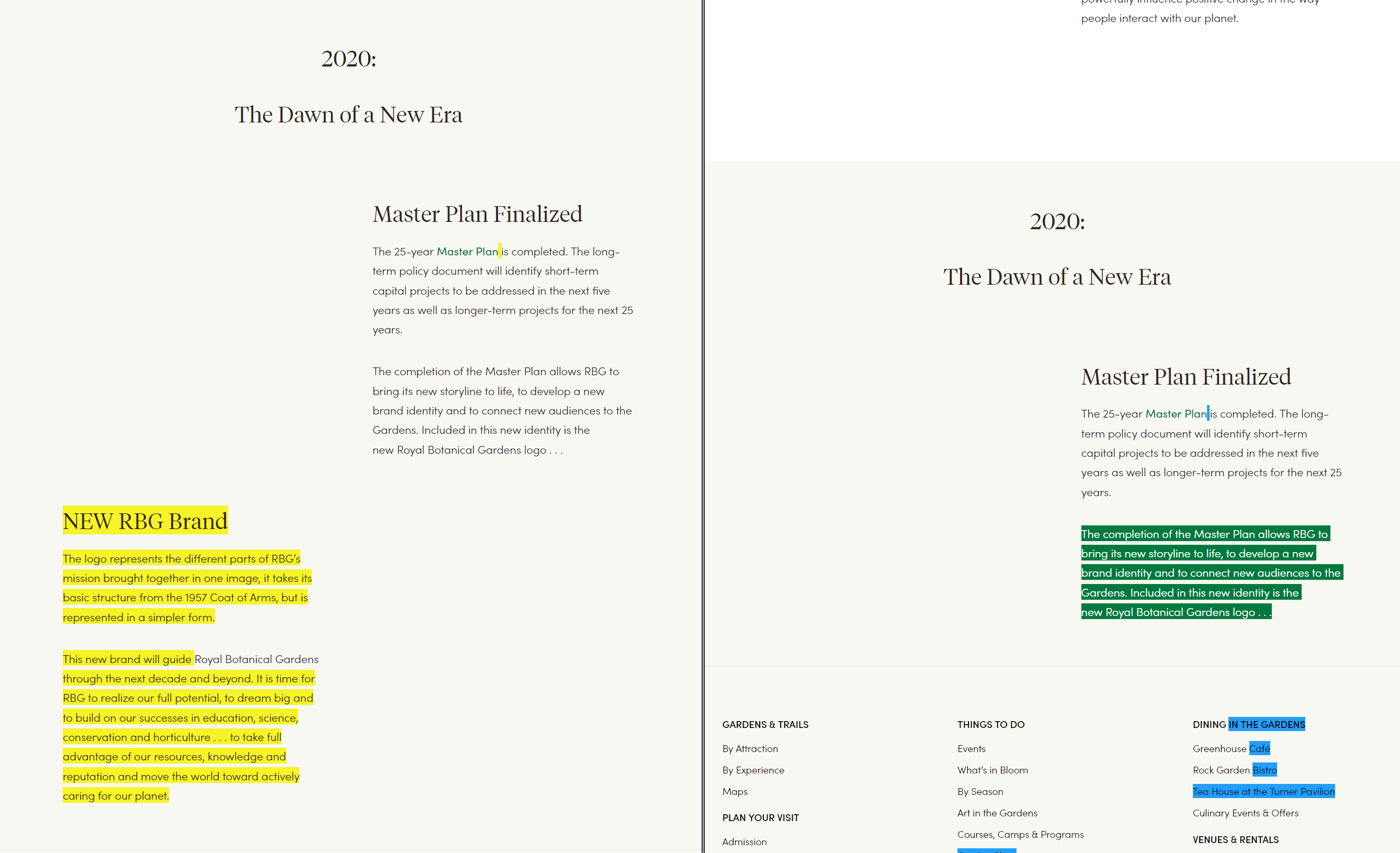
One of the germs of this idea came to me when a local institution, the Royal Botanical Gardens (RBG) rebranded several years ago . I really didn't like the rebrand, partly because it replaced a brand that was already very strong and that I had personally grown to feel positively about, and partly because I thought it wasn't very good.
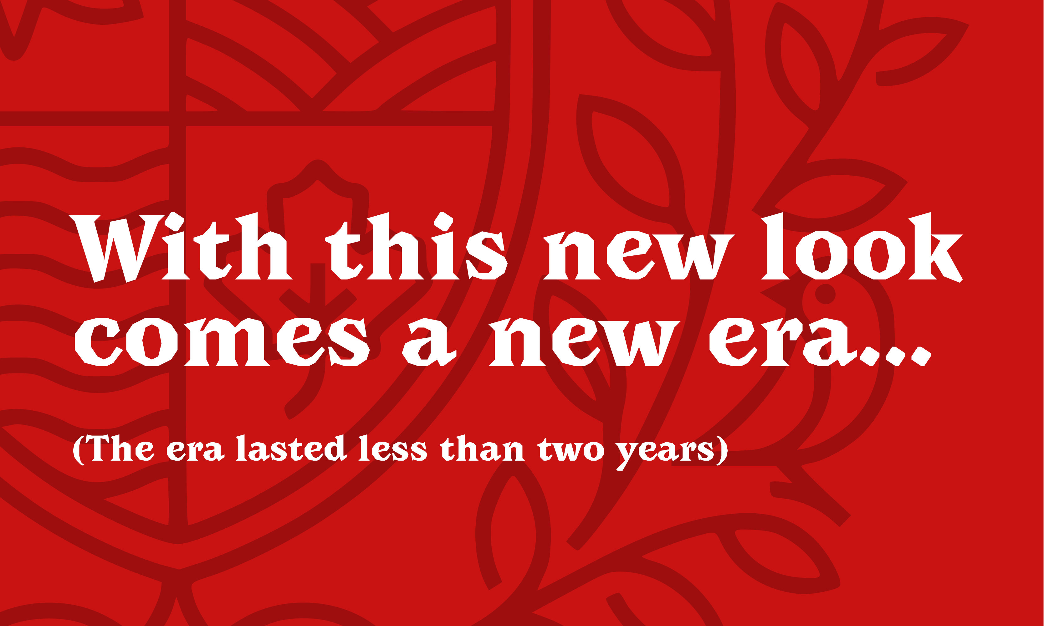
Along with the new logo came, of course, some bullshit. The logo was presented as better representing so many things that mattered to the RBG and their community. The wispy, generic line drawings were actually a "meaningful" way of presenting the values at the core of the organization. And they shared this bullshit proudly! While they slowly had this ineffective brand trickle out and replace the old branding in the wild, their website prominently shared the intention behind the rebrand, what the logo represented, and how all the money and creative energy that went into the process would lead the RBG confidently into the future.
Then, only a few years after the rebranding launched, the old logo was suddenly back without any fanfare. It felt like a real “Mandella Effect” moment for me. Had I slipped into another universe where this trendy, ineffective brand never existed?
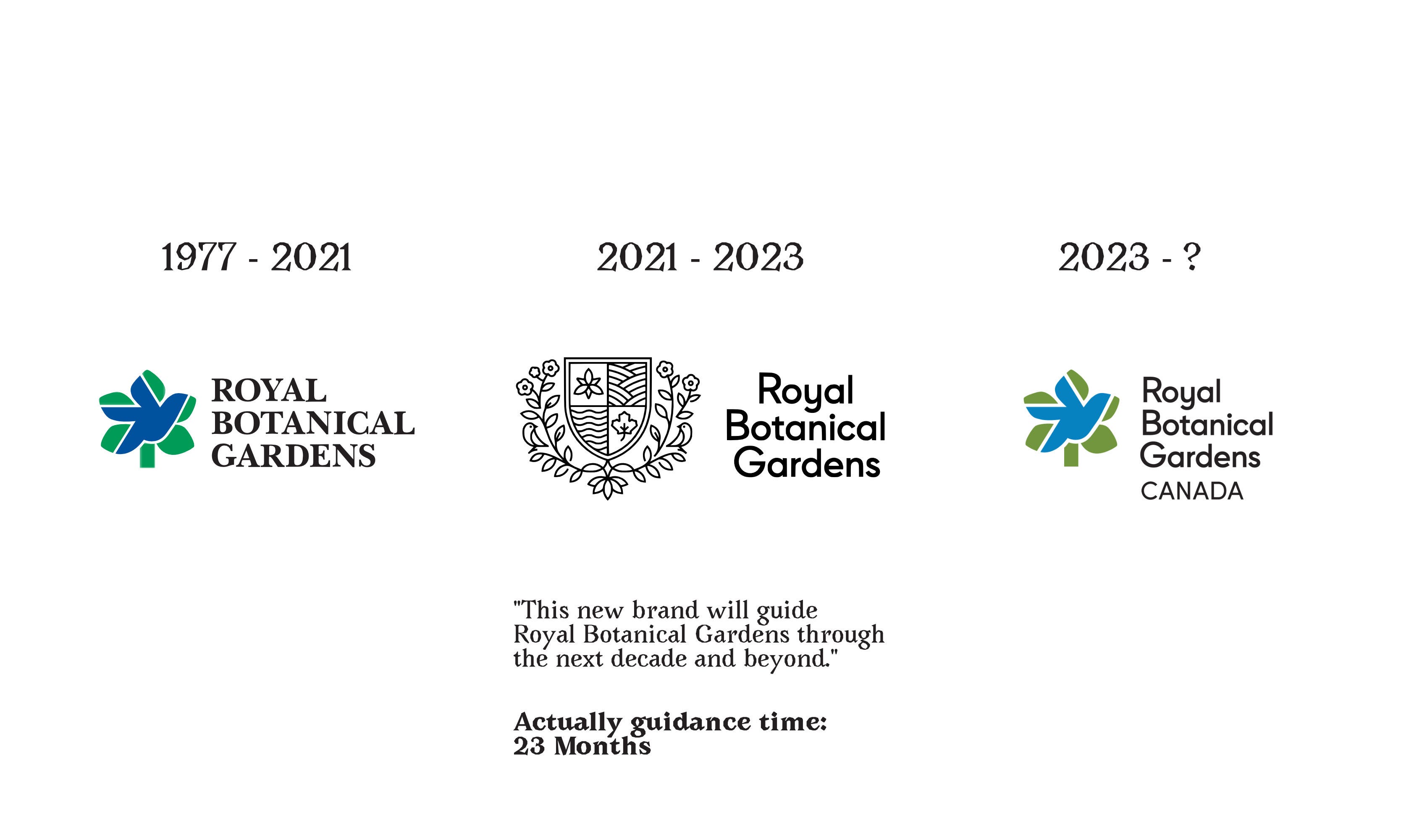
To further cement my dimension-hopping experience, the old rebrand and all the bullshit behind it was scrubbed from history. Obviously it might be hard to put PR spin on undoing a large rebrand so quickly, but isn’t this a chance to be honest, when the rebrand instead seemed so dishonest? What happened to this new logo representing the organizations's new direction better than the old logo? What happened to all that meaning? Were you just lying to us?
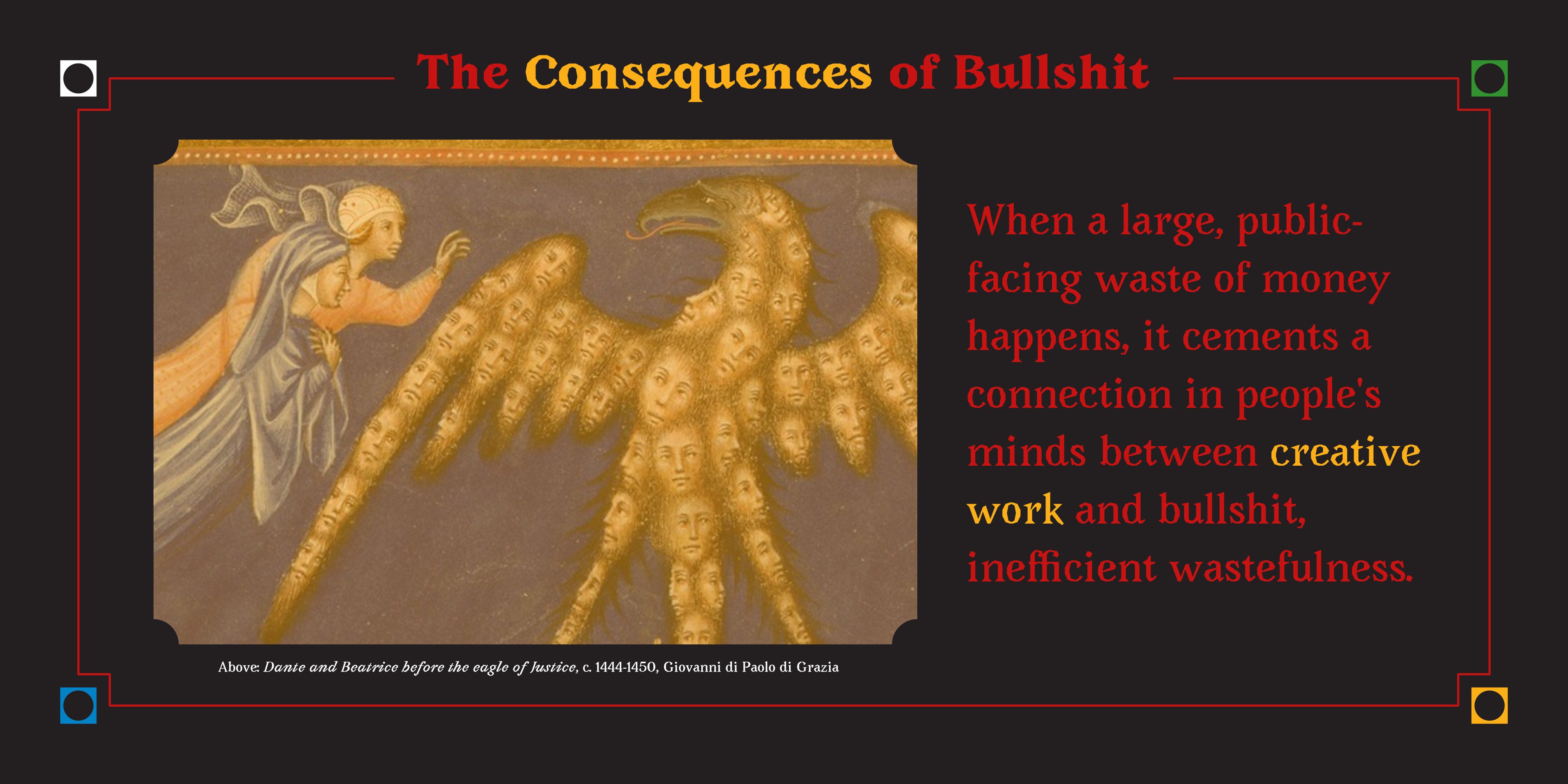
Not only does this kind of reversal betray the bullshittery and lack of actual thought that went into the work, it wastes a lot of time and money. When a large, public-facing waste of money happens like this it cements a connection in people's minds between creative work and bullshit, inefficient wastefulness. When we look at it this way, we can start to see why people might believe "Creative Work = Waste of Money."
I believe that creative work can bring immense value (deeper than monetary value) to people's lives and their work. But that argument gets harder to make when more and more evidence piles up pointing to the opposite. Add to that the mountains of hollow slop coming from gig-work platforms like Fiverr, not to mention generative AI, and it starts to feel like the foundation of one of humanity's core experiences is being eroded out from under us.
I don't like that at all.
Call Out the Bullshit
The only way I can think to fight back against this is to call it out. Don't be a dick about it, but don't let people get away with it, either.
If you see someone pretending the ideas behind their work are divinely ordained, call them out or challenge them on it. If you see someone saying that their way is the one true way thing should be done, call them out. We need to make it morally unacceptable to erode public trust in creativity, just like how we need to fight back against people eroding the trust in medicine, science and truth.
And if you're out there spreading the bullshit, go take a long look in the mirror. Then, cut it out. It's not cool, and it isn't helping anyone. Resist the feeling that your work is somehow not enough, because bullshitting about it only makes it worse.
We need to be honest and transparent about how we work. Obscuring or mystifying creativity only gives people more ways to poke holes in it. If you're worried people won't value what you do if they know how it really works, imagine how much they'd value it if they think its all bullshit!
Sorry for writing "bullshit" so many times. I’m gonna go wash my mouth out with soap.
Lots of love,
Simon 🐒
The artwork used throughout this piece is from a series of illuminations depicting Dante's Divine Comedy. Sourced from the Public Domain Review, these works were created between 1444 and 1450. "The first two sections of Inferno and Purgatorio [were] drawn by the lesser known Priamo della Quercia (active 1426-1467), while the Paradiso section was illustrated by Giovanni di Paolo di Grazia (ca. 1403-1482)."
The font used in the images is Avara from the Velvetyne font collective. I really like it.
You can see the old RBG rebranding announcement near the end of this video, which is still live on the RBG site.
Another insightful essay!! I really enjoyed this one, Simon. I had no idea about the Pepsi rebrand. I learned something today 😁
SIMON THIS IS BRILLIANT