

What your favourite political party's graphic design says about you.
Reviewing the design of the party platforms of the 2025 Canadian Federal Election

Hi,
It's election day in Canada, and to celebrate I thought it would be fun to look at how political parties communicate to understand a bit more about how they operate, what they value and what they think of you. This was inspired by the Conservative Party of Canada releasing their platform incredibly late into this election cycle and seeing people covering everything about their policy. It made me curious – what about how they present their policy?
This is what I do every day. As a (graphic, brand, communication) designer my job is to help figure out how to communicate things what matters most to communicating an idea. How do you present ideas to an audience to help them understand it? How do you avoid confusing or obscuring the point? Ideally, how do you avoid being manipulative or misleading? But also how do you communicate ideas in a way that helps people understand who you are? All of these things are things I think about every day, and I think slide under the radar for a lot of other people.
So, I went a little nuts, and I reviewed the election platforms of the six most commonly discussed political parties in Canada to see not what they say they'll do if they're elected, but how they say what they say they'll do... if that makes any sense. It was immediately illuminating and while I don't think it will sway any votes (hence this coming out on election day, not before it), I'm hoping that it will help you see how people in power communicate ideas (or fail to) and that in the future you will consider how the effort someone does or doesn't put into communicating with you may hint at how much they actually care about you.
This became a real deep dive, so I'll try to make it as consumable as possible. However, if you'd like to review my insane conspiracy board instead, you can feel free to enjoy it here. Links to all the things I’m referencing can be found in there, and a lot more fun visual samples!
The Parties
Let's start with a high-level overview of the parties and what my major takeaways of their platforms were.
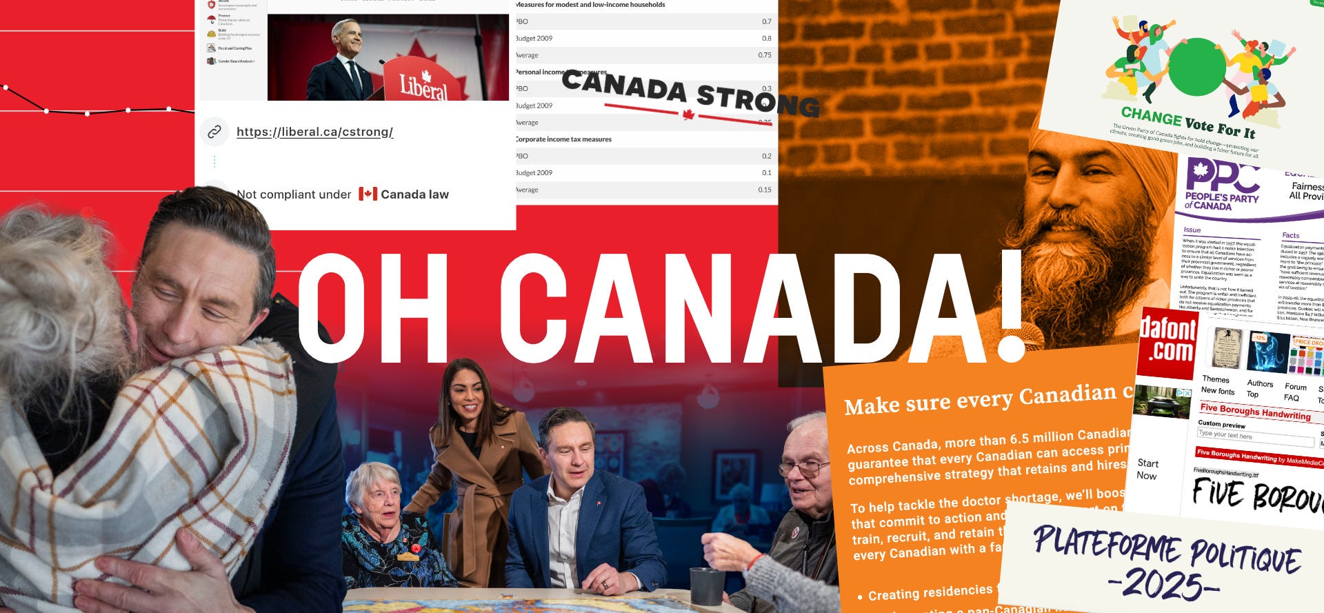
Liberal Party of Canada

The Liberal Party's platform looks like a strategic plan document for a for-profit hospital. It's slick, technically well designed and competent throughout. But it is also the only platform that makes a point of putting a copyright notice on it, and it seems more concerned with itself that with communicating its ideas. It doesn't feel badly designed but it doesn't feel designed to be read, either.
Conservative Party of Canada
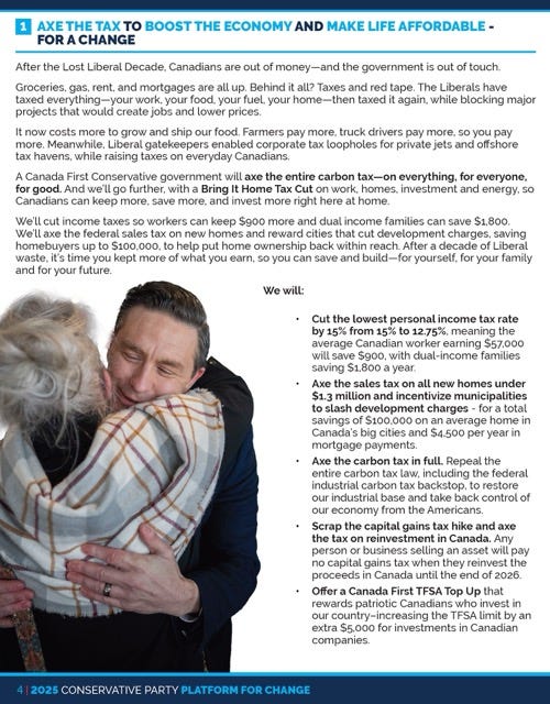
The Conservative Party's platform is a fucking mess. First of all, it's huge considering what's actually inside it, and that's mostly because of all the giant, uncompressed photos of Pierre Poilievre they filled it with. The actual design is haphazard and unappealing. It looks almost like it's just using the default text stying of an InDesign document, but then someone did enough to it to start messing things up. It feels rushed and like nobody cared about the presentation of the actual platform.
NDP

The NDP's platform is such a perfect metaphor for the NDP. Putting aside the actual content of the platform, the way it is presented just feels like nobody had the time, resources or energy to consider anything going into it. It's only available on their website (which is probably fine) but the majority of the platform content is displayed in white text on the eye-searing NDP-brand orange. Just like the NDP makes it feel hard to vote for them, they're also making it hard to even read if you should vote for them. It's embarrassing.
Green Party

The Greens are, as they tend to do with their place in politics in general, seemingly the most competent platform that nobody is going to read. They recently rebranded and it really shows on their website – the design is really consistent, appealing and presents their ideas in a digestible way. They don't lean on the persona of their party leaders at all, and they seem to actually care about communicating clearly and concisely.
Bloc Québécois

Like the Bloc's unique position in Canadian politics, their platform is unlike anyone else's. They don't have any of their platform on their website – it only leads to a PDF download – and the PDF of the platform is easily the slickest, most professional looking of the parties. It looks more like an in-flight magazine than a party platform which, honestly, says a lot about the energy they put into hoping someone might actually read this thing.
People's Party of Canada
This thing is insane. It's the digital document version of talking to a conspiracy nut by accident. It's long, rambling, incoherent – and I'm only talking about the design. On their website, it has the insidious visual styling of a charity with this weird, overly-optimistic aesthetic while they talk about some of the most vile things. Top to bottom, the whole thing feels psychopathic – so it's very on-brand for the PPC! Well done!
Deeper Dives
Here are the deeper dives into the platforms where I'll share some of my favourite tidbits about their design. Each platform was very different and so it's hard to compare them evenly, but I think it's fun to see how they all seem to mess up simple things and, especially with the major parties, you get the impression that none of the parties actually expect anyone to read these things.
Liberal Party of Canada
Key Takeaways:
Entire platform is on their website
Their platform leans heavily into the branding "Canada Strong" and the face of the party leader
Couldn't find the PDF of platform on their site – had to search for it – but the content is the same as the content on the website
Well designed (both site and PDF), but pretty generic and boring
The whole thing feels more like a corporate annual report than an inspiring message of change
The most successful use of graphs, diagrams and design elements of all the parties
Decent hierarchy and breakdown of information
PDF Stats
PDF Platform: 67 Pages, 2 MB
The only platform with a distinct copyright notice on it
No alt text on graphs and figures, meaning the data within isn't available to people with accessibility needs
The Liberal Party's platform is totally competent. It's visually clear, doesn't create design issue and it fails to inspire in any way whatsoever. In that way, I think it's very on-brand for the liberals and its actually a fairly authentic representation of the party and their platform.
They don't overuse photos of Mark Carney – but they don't not use photos of him either.
It feels like the visual style is meant to be one of Carney's boring suits. You won't really consider it when it's in front of you and you certainly won't remember it once you look away. That isn't a criticism, either. They seem to have really taken the approach of being very safe (conservative?) with the design so that it isn't challenging the reader and isn't getting in the way.
Overall, this feels like the stock political platform. It's what you'd imagine every party would do. It's plain and uninspiring and also not dangerous or frighteningly incompetent.
...speaking of frighteningly incompetent...
Conservative Party of Canada
Key Takeaways
the PDF of the platform is clearly an afterthought
the website doesn't lead you to the PDF, it leads you to little propaganda videos of their top-line issues
the actual presentation of the platform is a mess
this is the party leaning most into the identity of their leader
the platform is cynical in its design – it looks like something you rush because you don't give a shit about the person you're presenting it to
PDF Stats
30 pages, 12.9 MB
shitty file name for a public-facing document
no alt text, no title, no heading tags, bookmarks... basically no modern PDF technology that could help someone read this document
surprisingly – designed on a Mac!
The Conservative Party's platform is aesthetically offensive. It's so clearly not a priority of the party that it has ended up looking like the rushed homework of a high-school communications student that forgot they had a project due and doesn't really care about the class beyond getting a 51. It looks rushed because it likely was, but that is all given a strange feeling because the horrible design is juxtaposed against so many (too many) glossy, professional photographs of Pierre Poilievre smiling like a lunatic.
There's a clear distribution of energy in the design where we see the content of the platform being rushed and treated like an afterthought, while the representation of the party and the party leader are given budget and resources.
The document design is a total failure. It's visually cluttered and messy and not really worth talking about. The most notable thing about this document is that you can pull out some funny photos of Pierre Poilievre with a transparent background – but then you realize he is so uncharismatic that it isn't even really much fun to do anything with those photos.
If you could design a document that perfectly encapsulates feeling entitled to someone's vote, this would be it.
NDP
Key Takeaways
this thing is so lame
the NDP are perfectly presenting their ability to drop the ball with this platform
it's so hard to read
it's so boring
PDF Stats
none
The NDP don't have a PDF of their platform (that I could find). The entire thing is on their website and it is never referred to as their platform. That means that I didn't even realize it was their platform at first, because they decided to name the page "commitments" instead. However, it should be said that they clearly knew it was their platform because the images are tagged that way in the CSS. I don't understand why you would obscure this basic information.
The actual design of the platform is both boring and amazingly incompetent. It consists mainly of text – lots of text – with a very basic structure breaking each section of the platform into chunks. However, the actual content of the platform is presented entirely in bold, condensed white text on either NDP-orange or some intense bright blue. This has the effect of making the content of the platform both visually cluttered, boring and physically hard to read. A real achievement!
I can't think of a better way for the party of missed-opportunities to further cement themselves as unable to do simple things.
Green Party
Key Takeaways
The most different feeling platform and party
Very friendly and appealing design
Nicely presented online, and maybe overly presented in their PDF
The only party offering an audio version of the platform (though it is just read by a robot)
PDF Stats
124 Pages (!), 1 MB
Almost entirely text
The Green Party rebranded recently and it is treating them well with this platform. It looks fresh, well put together and is very inviting. This feels like something they expect you to read, and so they present the ideas in an appealing and interesting way (online, at least).
You can download both a PDF and an audio version of the platform, which is unique to all the parties. However, the audio version is just a multi-hour file of a text-to-speech bot reading the platform (it's no Andy Serkis reading The Fellowship of the Ring).
I imagine they did this because nobody had time to sit and read the entire platform into a mic, and I don't blame them because the platform is long as fuck. Part of how you present ideas is how you curate ideas and the Green party seems incapable of editing themselves down. Their platform PDF is the longest of all the parties, and it very notable doesn't use any images, even though the website has some nice illustrations paired to the party platform that could have been sprinkled in.
This feels like the platform is designed to start online and only be read by the most dedicated of followers, whereas the other parties treat the PDF as an option for consuming the same content as they have on the website. I don't actually mind this approach, but it isn't presented clearly enough and I can imagine some people downloading the PDF before they read much on the site and being turned off by how long-winded it is.
Bloc Québécois
Key Takeaways
the most polished PDF design
feels like a magazine (not a cool one) more than a platform
lots of generic images, not a lot of informative images
prepared much earlier than the other parties
the only platform with a "conclusion" that tries to end the platform with some kind of final idea
PDF Stats
34 Pages, 2 MB
No alt text or other PDF features
Main fonts used are from dafont.com???
The Bloc's platform is notable for being only available as a PDF. When you click "Plateforme politique" on their website navigation you just get a download of the PDF.
The PDF itself make a good first impression, especially compared to the competition. It's the most "designed" of the documents and feels like a print design file more that a digital policy document. The more you look at it, though, the more it feels like a stock template or a placeholder layout for something else. The images aren't very additive and the layouts just add design to the page, not understanding. It's all a bit "style over substance."
People's Party of Canada
Key Takeaways
I probably should have used a VPN before I went to this site
This platform is the most vile in terms of policy, and so while I'm not talking about policy here I do think it should be called out how awful these ideas are
Juxtaposing the nastiness of this party against the presentation of the ideas makes it all feel very bizzaro and confusing
The PDF of the platform looks like the ramblings of a madman
PDF Stats
43 Pages, 9 MB
Just a bunch of different PDFs glued together
The PPC is a bad party. They do a fine job reflecting this in the design of their party platform.
Honestly, I dug more into it in my research but I don't really think they're worth the energy to dig deeper into.
What we can learn from this
How people present ideas says a lot about what they think of both their ideas and the people they are presenting them to. It also says a lot about the care they put into things – design isn't simple and it requires detail-oriented thinking or a certain degree of thought to present ideas clearly and interestingly.
Looking at how political parties present their platforms says a lot about the parties, but also about our system. In theory, these documents should be the most important thing the parties produce. This is the entire plan they have for how they want to govern. This is what they actually say they will do. And yet, for most of the parties, this seems like an afterthought or a box to check and I don't imagine they're wrong about that.
The fact that the Conservatives could release their platform after the advance polls closed and less than a week before the election should mean that they've completely dropped the ball and nobody will vote for them. Instead, they have a decent shot at forming government. Imagine that in any other context – a business presenting their plan after getting the loan, or a person handing in their resume after getting hired for the job – and you start to see how absurd this is.
The way these parties present their ideas says so much about who they are, but the sad thing is that it probably doesn't matter. As citizens, we need to start looking more closely at what and how politicians communicate and be more critical of these things if we ever want to have politics that are driven by anything deeper that partisanship or personality cults.
Don't forget to go vote today if you haven't already!
Love,
Simon 🐒
Great insights, Si 👏🏼 Love your writing style..always entertaining!!
This was a hilarious read and a great momentary distraction from my nerves for today’s election